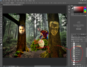
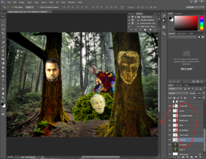
So my morphing isn’t going well. Things still fall out of place and don’t look real. I think I need some tweaking with the color tones and contrast. I also think some parts are also overly saturated and under saturated. The cropping is kinda hard. I think I need to learn some more professional level cropping techniques. Sure, I know to crop somethings it does take alot of time to do somethings. I need to lean to really morph textures and masking in textures. possibly cropping more parts of the face to integrate into someting else, Animal-human face integrating.
Month: October 2015
Journal 4: Integration and Integration(Hyp)
Its really hard to integrate things correctly. What sends the right message? What sends the wrong ones? How can it look like its realistic and also how can it look messed up and so out of place? The questions go on and on. I have been trying to incorporate different photoshop techniques to keep all the objects into position of where each of them all belong. I have been working in the computer lab to further progress the work I am doing however only so much can be shown.
I added Connan o brien and made him a deer and I added different saturations to make something stand out or stand in. Its not working out the way I want it because there is a weird color contrasting going on with the outline
Journal 3: Naming Conventions and more
You know, with all of those naming “layer” + a number + “copy” it gets pretty confusing real quick. Unless of course you have a super memory that’s light years above everyone or have just unconventional methods of retaining information. For most people, having many generic named layers, it gets rough. Trying to find your background layer when the little preview box is so small. Well, the background layer may seem distinctive but what about those little figures that you have separated from the rest of the picture? You know having good naming conventions is a good habit that everyone should keep that can really improve your workflow in every aspect of your life. When you step back and search a few months or years from now, it won’t be so hard. I use this concept during programing. it gets very confusing when you name your variables dt for date and d for distance as such they can be used for both. Take the extra time to write out the entire name, distance for distance and date for date. It may seem like you are slowing down your workflow however on the long run, I think you will thank yourself for doing so.

Journal 2
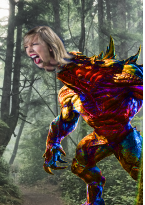
(Taylor Swift’s Singing head being fused slowly into a colorful monster)
Progress is slowly happening. added a few celebrity faces. Still working on the skin integration. I think I am planning to have Kanye, Taylor, Tom Cruise and others I will still think of. Some exact pictures I want to find aren’t really available however I did find some alternatives to the realism of the sketches, same concepts but not exactly the same position. I want to make it close to my sketch as possible.

Its hard to find a celebrity with the right faces and contrast for a tree, but for the most part I have to make leveling and contrast/brightness adjustments and then using the layer effect adjustment to make the blending happen.
Journaling 1: Great tutorial and learned progress
You know what’s really interesting? New Photoshop techniques. In particular it’s the common, face mapping technique which really helps people with changing regular looking people to look like a rock creature or a man of the deep seas without going over the top. I was really excited about learning this technique. I really like the fact that I can take something lets just say a mountain’s ripples and use those rough edges and use it for the skin texture. He doesn’t have to be shaped like a mountain to be a mountain man. He just has to apply hyperrealism concepts into it. That is to apply realism to a fake picture. It’s as if the picture was taken that way. It’s really interesting. One thing you really have to be familiar with is the overlay technique and masking.
http://www.photoshopessentials.com/photo-effects/texture-map/
My project on hyper realism is pretty straight forward and simple. It fosters aspects of nature and the people at the pinnacle of pop culture, essentially a celebrity. So to bring those aspects together I will have to apply some textured mapping along with some saturation integration (whatever its called)


